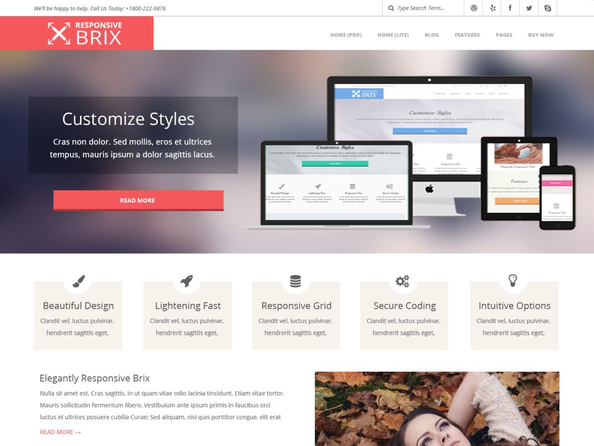

Responsive Brix is a minimalist, fast loading ('A' Grade Google Page Speed), retina-ready, responsive theme with a modern bold design and easily customizable options. It is perfect for web agencies, studios, photography, portfolio, churches, corporate, personal and business websites. Easy to configure and customize, Responsive Brix comes with Full Width Stretched and Boxed layouts, beautiful HTML and image sliders, lots of color options, easy logo upload, 360+ font icons, pagination, custom widgets, sidebar options, and a lot more. It is built in HTML5 & CSS3, is SEO friendly, mobile optimized and retina ready. This theme is also translation ready. The theme is rigorously tested and optimized for speed and fast page load times and has secure and clean code. Theme support is available at https://wphoot.com/support/ You can also check out the theme instructions at https://wphoot.com/support/responsive-brix/ and demo at https://demo.wphoot.com/responsive-brix/ for a closer look.
Responsive Brix
Product information
Version 4.10.0 (Updated )
Reviews
4.8 out of 5 stars
Features
- Block Editor Styles
- Blog
- Custom Background
- Custom Colors
- Custom Logo
- Custom Menu
- E-Commerce
- Education
- Featured Images
- Footer Widgets
- Full Width Template
- Left Sidebar
- Microformats
- One Column
- Right Sidebar
- Sticky Post
- Theme Options
- Threaded Comments
- Translation Ready
- Two Columns
- Wide Blocks